RailLink

Project Overview
RailLink
Moving beyond simply transporting people.
Rail Link looks to create a carbon-conscious movement of green train-powered public transportation.
Our team looks to impact three main areas: Riders, Environment and Train Operators.
a) Riders: Incentivizing riders to use trains for environmentally friendly transportation.
b) Environment: Increase ridership, reducing environmental impact of less efficient modes of transportation.
c) Train Operators: Increasing exposure and ridership helps increase profit and drive innovation and more eco-conscious solutions.
Objectives
-
Design the mobile app for Rail Link that is user-friendly and easy to use with a clean design.
-
Develop an app that is able to have a point based incentive program to reward commuters choosing to travel via train.
Project Scope
End-to-End Mobile App, Branding
Tools
Figma, Adobe Illustrator, Miro,
My Role
UX researcher
Team
1 Project Manager
5 UI Designer
2 UX Researchers
Duration
3 Weeks (80 Hours)
Design Process
Research
Strategy
Design
Prototype
Research
Problem Statement
-
How can we incentive the public to use trains as a carbon-conscious form of public transportation while also using stations as a space for the community to connect and be educated on climate and green transportation options effectively and meaningfully for all stakeholders.
Goal
-
Create an app to incentivise the public to come into train stations and make use of their amenities.
Marketplace Analysis
Public trains are seen to be expensive and inconvenient in terms of navigating through the different stations. Owning and operating a car in Canada typically costs between $6,000 and $13,000 per year. Public transportation is a more cost-effective option. Partnering with transportation services such as GO Transit and GrandRiver Transit will allow GreenRail to reach a larger audience. Funding from these partnerships will make our app be more recognizable, trusted, and use to aid when traveling.

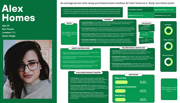
After talking to users, we saw users tend to be like Alex, a passionate rider and problem-solver. I created a persona for Alex and helped him develop a sustainable and economical solution to encourage more riders to use the transit system.
Opportunities for Improvement
-
Send to Friends to get rewards
-
A slide-in ad where the user can share the ad to an friend and recommended friends to share with.
-
Send and share would would be shown with different icons/button entirely.
-
Ability to plan out trip before and favorite their route system
-
A way to help and navigate route system and plan trips with users, a connective experience.
-
Have a point transaction history to view when and which points have been gained/redeemed
-
Show the process of how it will be scanned to earn points and the places to scan
Methodologies
-
Primary research ( User survey)
Assumptions Validated
Canadians use the trains constantly.
Validated. 42.9% people use public trains every day
People would like to have an application that helps navigate the transportation system and lines.
-
Validated. 87.5% respondents preferred having an application to use public trains and make the commute easier.
Most Canadians do not have knowledge of the current state of how the transportation industry impact carbon emissions in Ontario.
-
Validated. 62.5% of respondents were not aware of the impact of carbon emissions.
Roadmap
Strategy
I started to put the solutions I brainstormed into a list of product features to create a comprehensive product roadmap. These features were sorted into four categories, including Must-have (P1), Nice-to-Have (P2), and can-come-later (P3) features. They were sorted based on how well they can help the user goals.
Product Roadmap not only have the project goals into our product, but also ensures we prioritize the most important features in the development cycle.
Task Flow
.jpg)
WireFrames
Brand
.png)
At the core of our brand is Railink. The aim is to create a beneficial and inclusive environment by using an interactive and connective system with an interface. Along with points so that users get the optimal transportation experience.
Our logo features bold, angular lettering in black, light and dark green, white, and orange - each color symbolizing a key aspect of our brand.
Black for strength and power, green for sustainability, orange for trust and reliability, white for cleanliness and minimalist.
Our font choice is modern connective and clean.
Everyone can join for the betterment of the environment in the community.
Railink is sustainable, accessible, and inclusive.
Iteration
Test
Test Goals
- To observe users’ interactions with the app and evaluate
their experiences with the new messaging feature.
- To identify potential pain points.
- To define the quality of accessibility, flow, navigation,
information architecture, and general design of the addition.
.jpg)
I started to put the solutions I brainstormed into a list of product features to create a comprehensive product roadmap. These features were sorted into four categories, including Must-have (P1), Nice-to-Have (P2), and can-come-later (P3) features. They were sorted based on how well they can help the user goals.
Product Roadmap not only have the project goals into our product, but also ensures we prioritize the most important features in the development cycle.
Design


