Refind

Project Overview
Refind
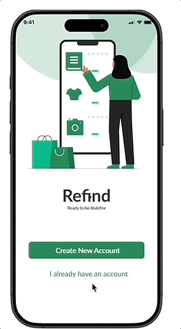
Refind is a second hand item app that empowers students to save time, efficiency and transparency in their shopping experience. Refind uses storytelling to redefine the way second hand shopping is experienced. This app is made by students for students.
I led the project’s vision and developed the visual style, designing key screens such as onboarding, payment, and privacy policy. I collaborated with the team to refine essential elements for usability and delivered the final presentations.
Objective
-
Create an app for students to help them purchase Second Hand-Items to find reliable sellers and avoid scams. Save money on quality products
Project Scope
UX Mobile App
Course project for a Master’s level Fundamentals of UX course”
Tools
Figma, Google Slides, Miro,
My Role
UX & UI Designer
UX Researcher
Slick Deck Designer
Team
Taniya Li
Tina
Asiya
Duration
4 Months Sep-Dec 2024
Design Process
Research
Problem Space
-
The second-hand marketplace has become increasingly prevalent, especially among university students who make up one of the largest groups of second-hand buyers and sellers with over 65% choosing to shop second-hand in 2023 (ThredUp, 2024).
-
Our background research identified that 72% of students had encountered quality problems with second-hand transactions (Wei et al., 2023).
-
These students want affordable and sustainable purchasing options, but face distinct challenges such as quality concerns, unreliable platforms, and communication issues (Yan et al., 2015; Wiseman, 2022).
-
Existing platforms do not adequately address the needs of these students, leading to inefficiencies and frustrations among their user base (Wei et al., 2023).
Problem Statement
How might we help university students who want to buy and sell second-hand items by providing a secure platform that is tailored to their unique needs, ensuring trust, transparency, and streamline transactions for both buyers and sellers.
User Research
I interviewed 3 out of the 8 student interviews to better understand the participants buying and selling second hand items experience. They all wanted to shop second-hand but...
Findings
Worry about item quality [8/8]
Fear scams and unreliable users [5/8]
Frustrated with the time-consuming process [6/8]
Competitor Analysis
As part of the competitor analysis, I summarized from our research findings to other second hand platforms like Refind. These were Poshmark and Facebook Marketplace.
Poshmark
-
private messaging, local search, and category filters Gaps: No verified user system - leading to a fear of scams No built in payment system Hard to find student-specific item.
Facebook Marketplace
-
Key Features: community-based shopping, secure payments Gaps: High fees on each sale (up to 20%) Shipping process is centralized, leading to delays especially for local transactions
User Persona
Define
I created two distinctive personas to help guide our users who were defined to represent two different user types from our user interviews.


User Journey Map
From the data I collected, I created a user journey map to identify the opportunities and behaviours of using our app Refind for both buyer and seller perspectives.


This is the buyer prespective of the user journey map when using our app refind
This is the seller prespective of the user journey map when using our app refind
Ideate
User Flow

This is a user flow of our app where we did multiple iterations and as a result, our site map was revised several times to ensure clarity before moving onto prototyping.
Roadmap
I started to put the solutions we brainstormed into a list of product features to create a comprehensive product roadmap. These features were sorted into three categories, including Must-have (P1), Nice-to-Have (P2), and can-come-later (P3) features. They were sorted based on how well they can help the user goals.
We wanted to directly address the pain points that we noticed during our user interviews. Here is an snapshot of the list
Low-Fi Wireframes
Buyer POV
Seller POV
Design
Brand

At the core of our brand is Refind. The aim is to redefine the shopping experince of secondhand items for students by using an interactive prototype.
We came up with a design system to evoke feelings of trust, sustainable, calm and innovative. This is how we wanted our users to feel while using our app. Our font choice Lato is modern connective and clean.
This app is made by students for students
Refind is trustworthy, efficient and transparent
Iteration
After the first iteration we tested out our prototype with other students in class to get feedback to improve on and see what's working. These learnings led to further iteration and revisions towards the final product
_edited.jpg)
#1 - Provide more guidance for users.
Issue: users were confused about the labelling for pending, expired, and sold posts.
Solution: We implemented a policy page that included an explanation of the different features of our app that users can access at any time.
#2 - More communication & reliablity
Issue: users were concerned about being unable to contact the buyer/seller if they were late for the meet-up.
Solution: offer a temporary texting/calling through our app only for the duration of the meet-up.
_edited_edited.jpg)
_edited.jpg)
#3 - Clarify Meet-up Structure [Sellers]
Issue: include weekends and more range for availability may be more desirable for users.
Solution: allow for users to easily select their availability across multiple dates and times, without having to tediously select and input the time for each date.

#4 - Clarify Meet-up Structure [Buyers]
Issue: the booking system is not clear and confusing to look at.
Solution: we designed the time-slots larger with additional information (like location) so that it would be easier for users to click into. Additionally we included new labelling for easier readability

#5 - Transaction Transparency
Issue: Some buyers may not want to pay for the item prior to receiving it.
Solution: Feature Paypal to protect users and their payments


Onboarding
One-stop-security for student access
Gives users a general overview with a private policy summaries on how to use the app. Each section can be clicked on to redirect them to a more extensive section.

Purchase - Buyer
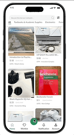
No chatting, just buy.
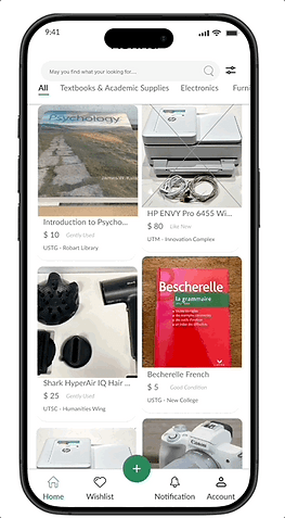
Users can scroll, buy and schedule a time in one smooth process.
They can view the listing and preview the detailed information of the listing.
The buyer can select the lister availability time to choose the best meeting time suitable for both buyer and seller.

Selling - Seller
Transparency on to go.
-
Transparent posts and easy scheduling. Create a listing, set your time and go.
-
Sellers can easily select and add their availability in. The seller can even choose to edit to add multiple times on the same day .
-
The user needs to upload a minimum of 3 photos and add a description to show the quality of the products.

Payment Detail
Secure Transaction
-
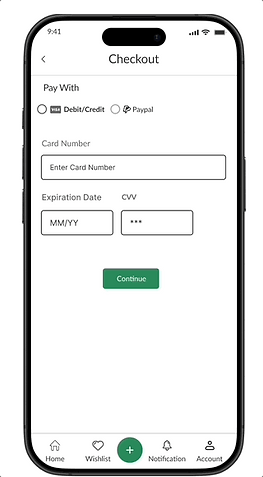
Users can use paypal or debit/credit card to ensure security and efficiency in the payment process.
-
There is a checkout process where the user can review the items they brought before confirming the purchase.
-
The user gets a confirmation notification going to their student email to have the item tracked and delivered.
Reflection
One of the most key aspects of this project was the exceptional teamwork. The team dynamic, collaborating, supporting each other, and working together allowed us to achieve a remarkable final product.
Being part of such a dedicated team taught me the value of communication and strong team bonds. In terms of the project content, looking back, I realised that a two perspective flow can be effective and complex to design.
I wish I had found a way to streamline the entire process from both the seller and buyer screens.
Overall, though I didn't have the chance to test how users interact with our final product, this process helped me gain design skills for UX and working on Figma. I found myself eagerly seeking more user feedback and challenging myself to achieve better designs.


